APPROACH
REVEAL DETAILS WHEN THEY ARE NEEDED
On the web, several panels can remain visible at once. On mobile, that structure leaves less room for data and controls. I separated market overview, instrument research and order entry into dedicated screens, giving each stage its own structure.
The order form brings essential parameters together, with additional settings available in context. This keeps the main flow accessible while allowing more detailed configuration when needed.
MY ROLE · MOBILE UX
FROM SHARED FOUNDATIONS TO MOBILE FLOWS
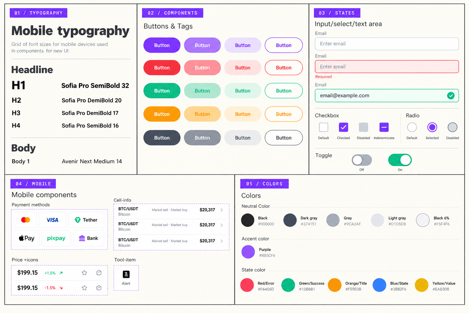
As a mid-level contract UX designer, I worked with a Product Owner and a small development team comprising a backend developer and a frontend developer. I created and maintained the platform’s design system and designed the screens, navigation and interactions for its first mobile version.
My work spanned the web trading platform, mobile experience, back-office interfaces and internal marketing products supporting promotion, alongside creating and maintaining the shared design system. This case focuses on the platform’s first mobile version.
PRODUCT LINK
EXPLORE THE CURRENT PRODUCT WEBSITE
The website is provided as a reference to the current product. It may reflect later changes beyond the scope of the work shown here.
VISIT WEBSITE ↗︎